Financial Market Analysis
By Shawn R. Carpenter
Monday, February 13, 2006
Yield Curve Inversion

The current market conditions are dictating that money flow into equities is very lackluster. As for the year, the market did rally as funds put a small portion of capital into equities. Yet we still have yet to see a large amount of capital being put to use on for money market funds. The link on this post's title will lead you to Investment Company Institutes (ICI) statistical research on where money is flowing. According to ICI, in Dec. 2005 money was pouring into money market accounts at a 3% pace over the prior month. This suggests that profits are being taken and safeguarded against interest rate developments (Bernanke is speaking on Wed.) as well as geopolitical tensions.
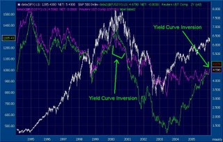
Looking at the chart above, the yield inversion between the 10 Year (white) and 2 Year (green) notes is shown at two different periods. The first period, roughly the whole year of 2000, show that the 2 year yield has risen above the 10 year yield. This pattern suggests that a possible recession lies ahead. Over time, this idea was proven by the lack luster performance of the economy from 2001 to 2003. The second period is the current state of the yield curves. Beginning in late Dec. 2005, this inversion seems to be gaining some momentum. If we see a continued inversion pattern between the 2 yield curves, 2006 might be a year of less than forecasted growth. It still needs to be determined if the economy can shrug this off, as some have suggested that this inversion means nothing. Seems like the late 90's tech rally when people said EPS and PE Ratios should be tossed aside. Follow the trend folks.
![[Most Recent Quotes from www.kitco.com]](http://kitconet.com/charts/metals/gold/t24_au_en_usoz_2.gif)
![[Most Recent Exchange Rate from www.kitco.com]](http://www.weblinks247.com/exrate/24hr-euro-small.gif)

